
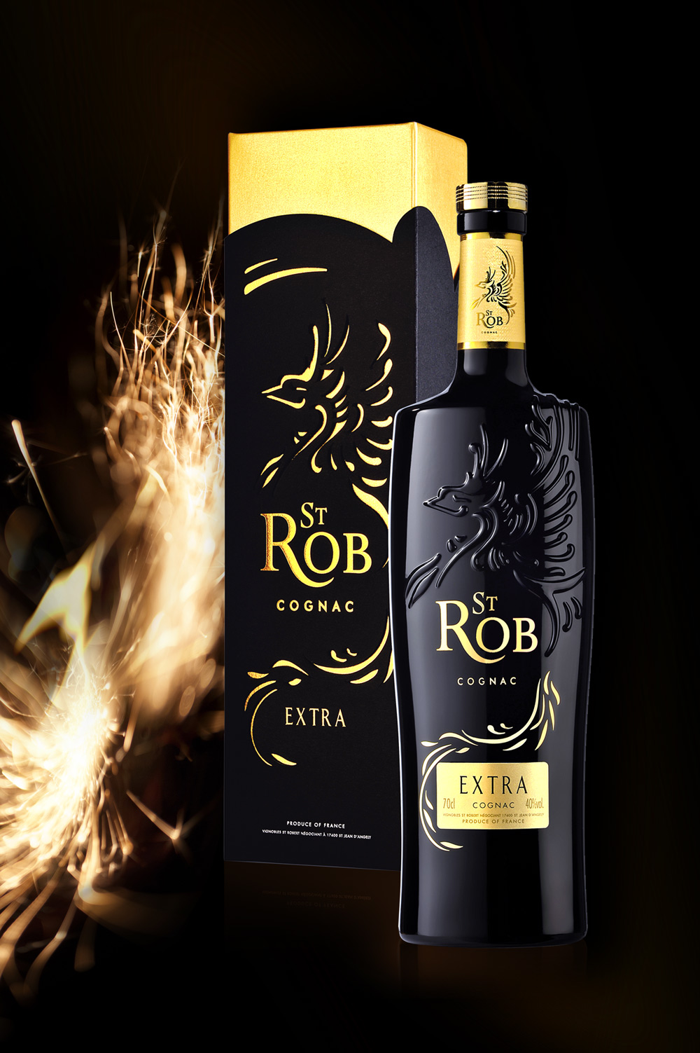
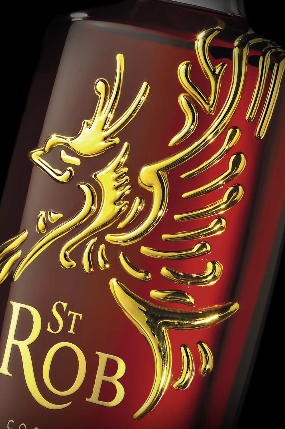
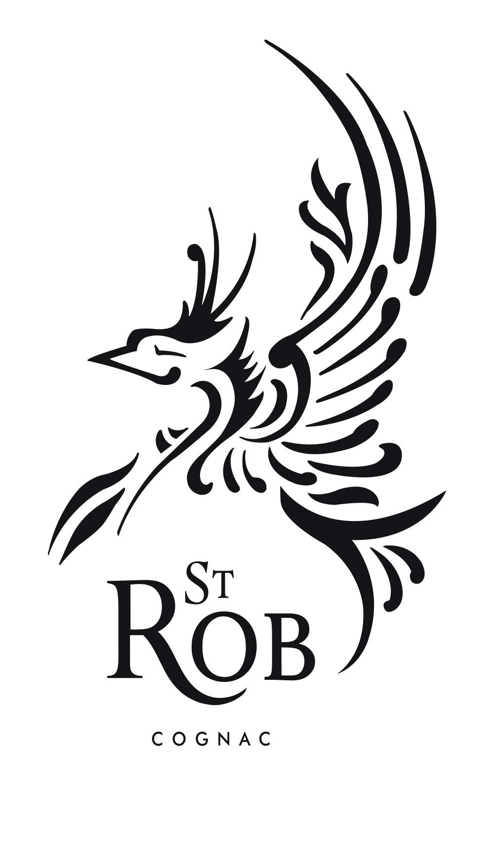
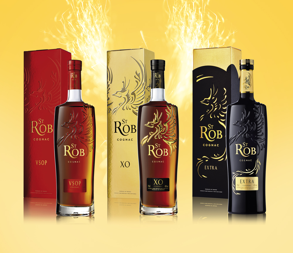
Doomed to disappear after many years oblivion, the formerly so prosperous Domaine of Saint-Robert is reviving thanks to the Chabasse House of Cognac. The rebirth of the Domain is also celebrating the creation of a new Cognac spirit brand, « ST ROB », whose design identity has been entrusted to Linea packaging design agency. The contemporary, impactful and timeless ST ROB brand is expressed through a strong symbol, the myth of the Phoenix reborn from his ashes. The derivated VSOP, XO and EXTRA ranges proudly sport this noble wide bird, as a tattoo encrusted into the glass. The Phoenix statutory posture as well as the high bottle shape are conveying and transcending this universal symbol on the Cognac brand. The technical innovation on this range can be seen through its packaging complexity, like the glass relief on the bottle shoulders, adorned itself with gold enamel for the XO quality. As a symbol of resurrection and eternity, the ST ROB brand carries the story of this unique adventure.
ST ROB – GAMME COGNAC
customer: CHABASSE
product: ST ROB – RANGE
market: CHINA
linea design manager: JEAN-MICHEL
designer: NATHALIE
illustrator: NATHALIE
developer: CÉDRIC
- Category: Works