
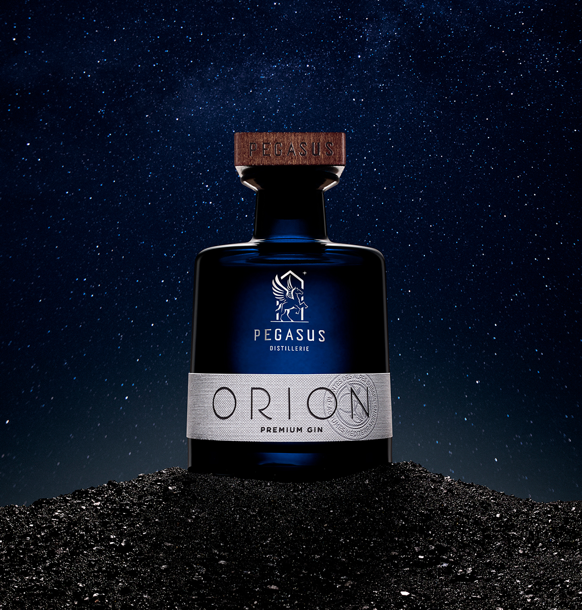
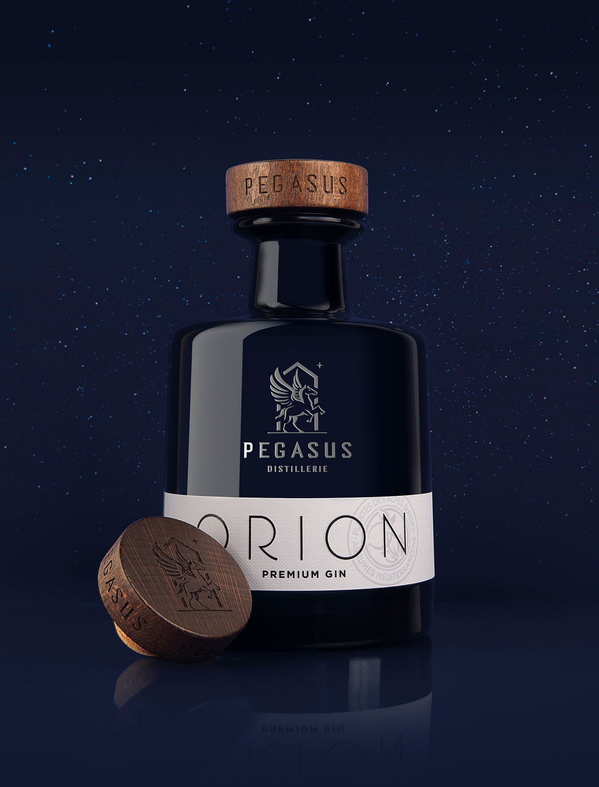
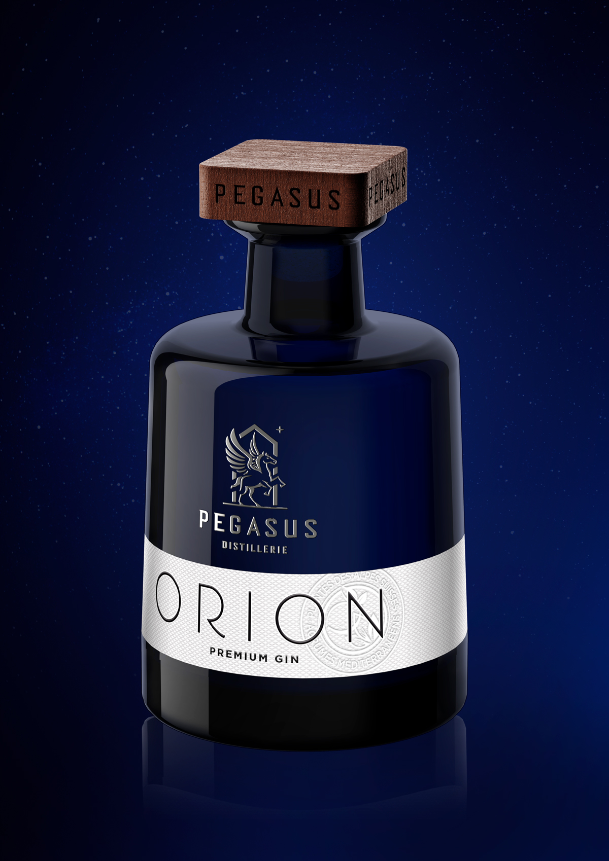
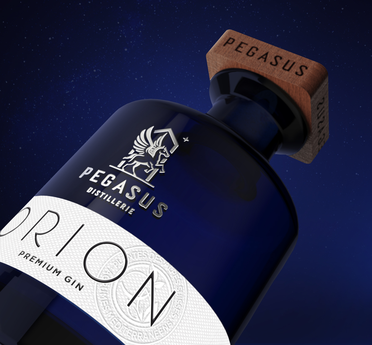
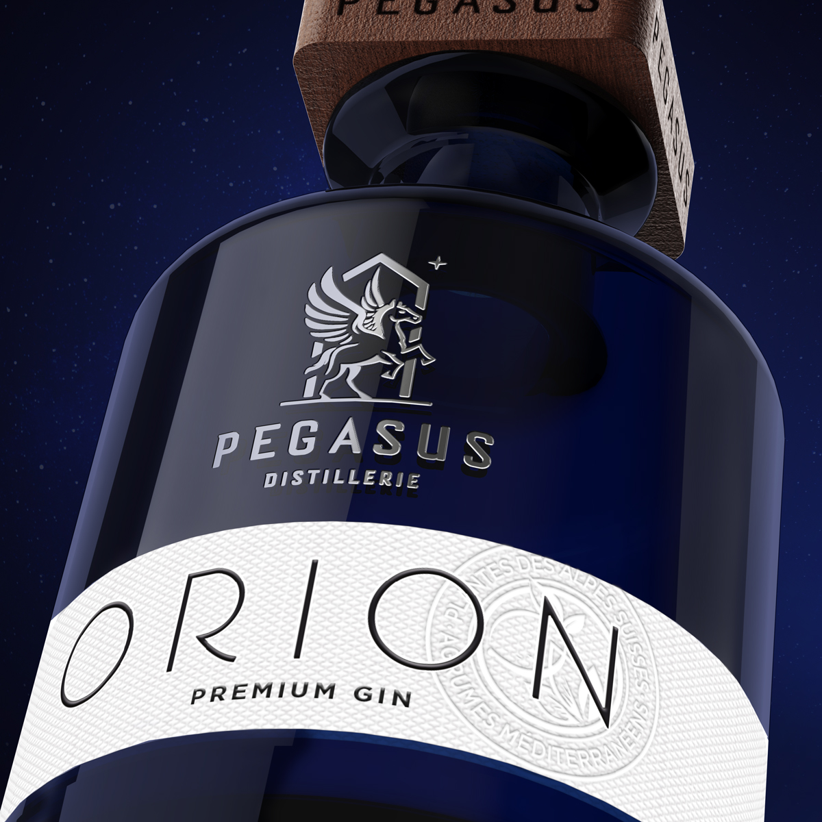
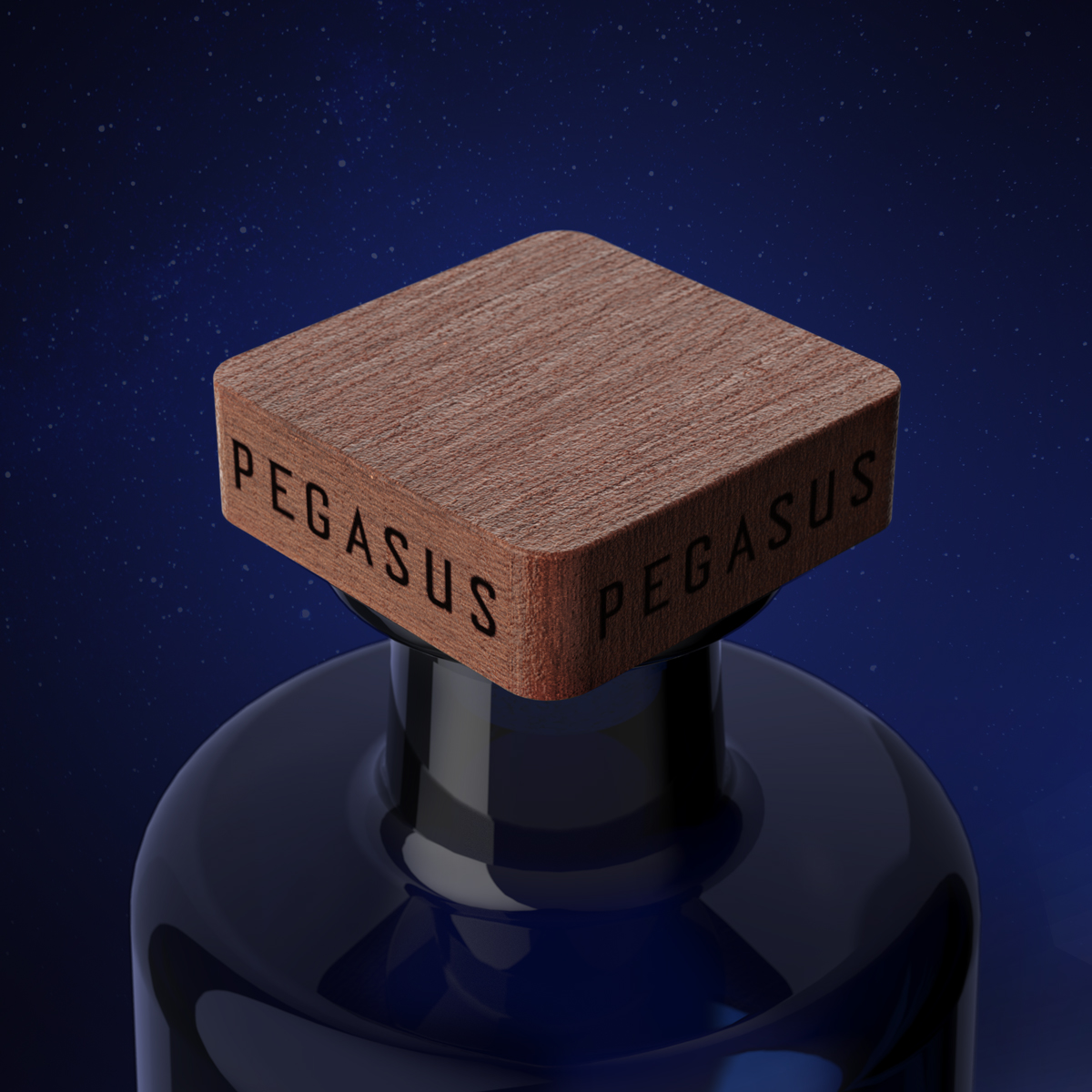
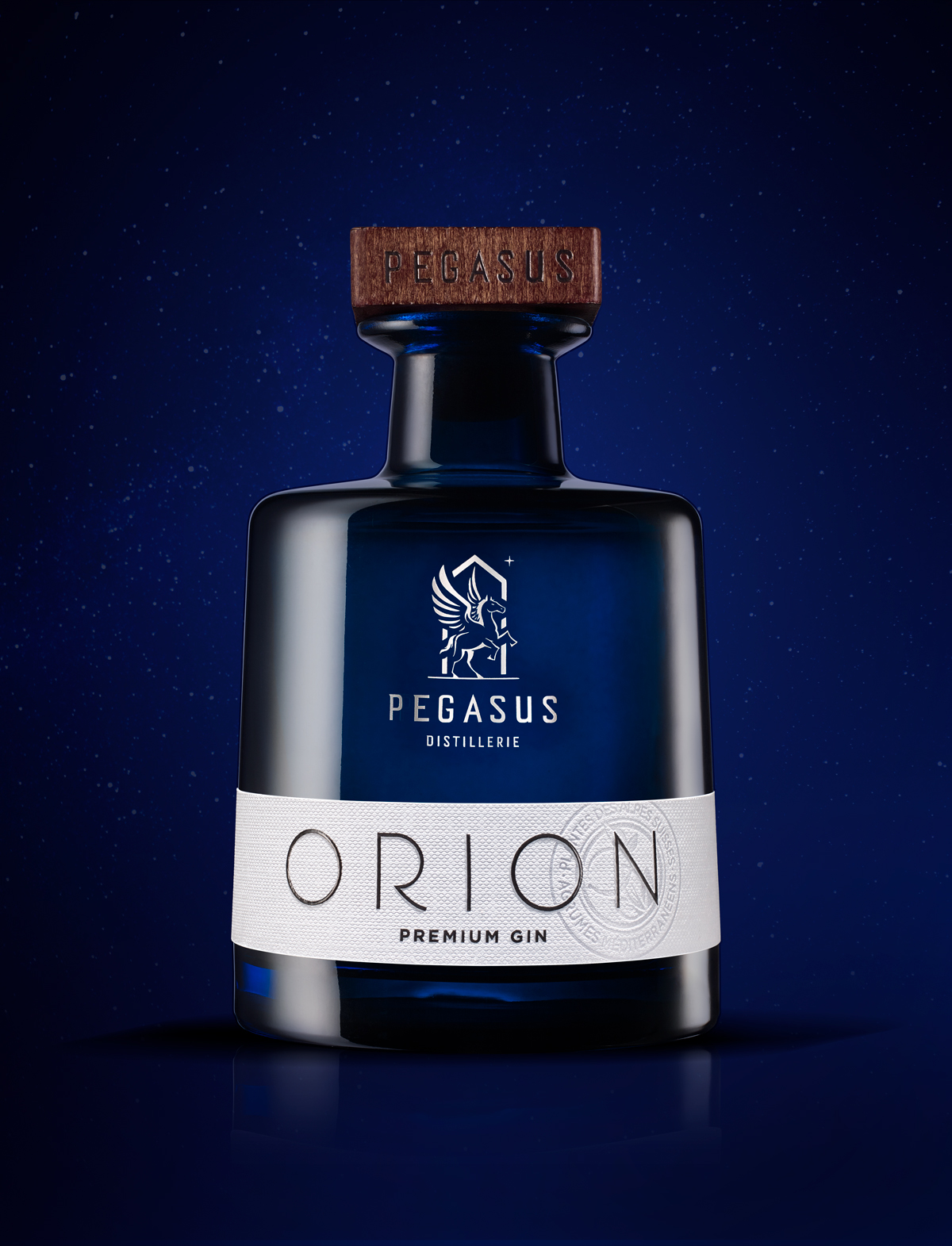
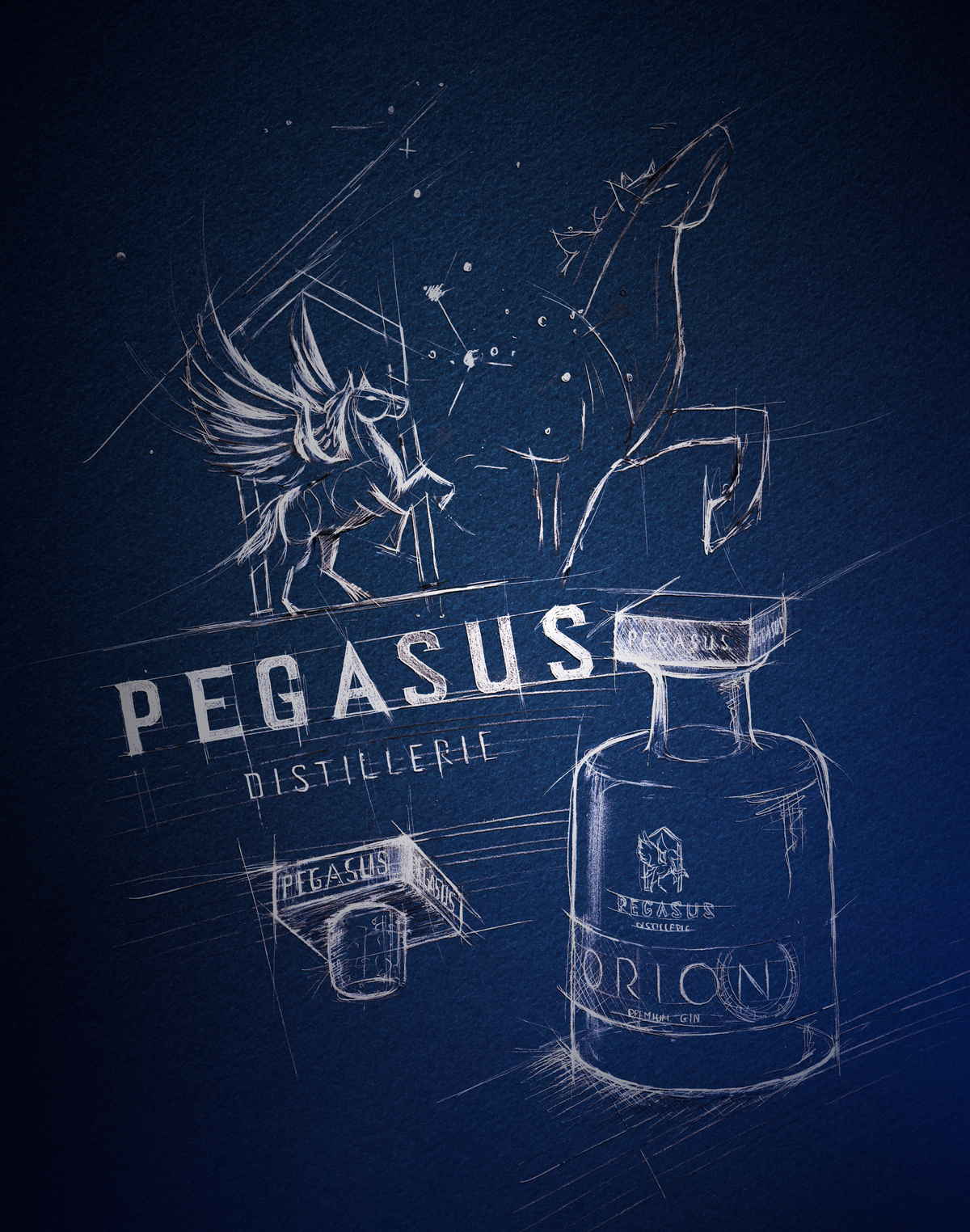
« For those who travel, the stars are guides ». Inspired by Saint Exupéry’s universe, we imagined the brand strategy of the PEGASUS Distillery. After defining its brandbook and visual identity, we created the ORION Gin – the first opus of the multi-spirited collection. Here, the deep blue tinted bottle reminds us of the grandeur of space. The bottle’s imposing shape, despite its small capacity (50 cl), recalls the codes of the category. Its wooden cap is the premium and authentic touch. Its square shape is also a nod to the shape of the still. The logo in shiny silver silk-screen printing claims a high-end positioning. As for the belted label, it proposes a very pure white management for this organic gin.
DISTILLERIE PEGASUS | ORION GIN
Customer: DISTILLERIE PEGASUS
Product: GIN ORION
Market: INTERNATIONAL
Design manager: VINCENT
Designer: CAROLE
Photographer: GILLES DE BEAUCHÊNE
- Category: Works