
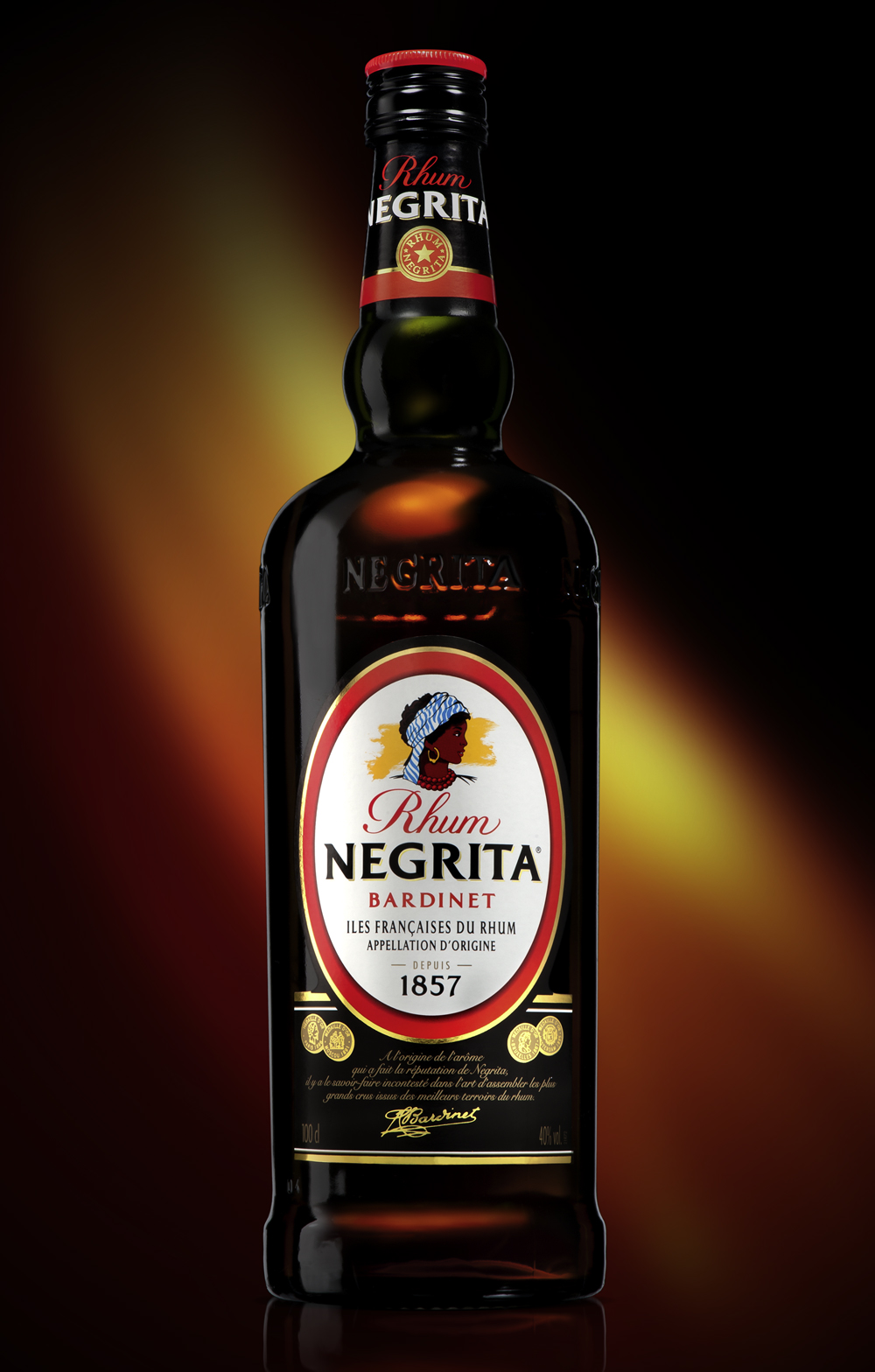
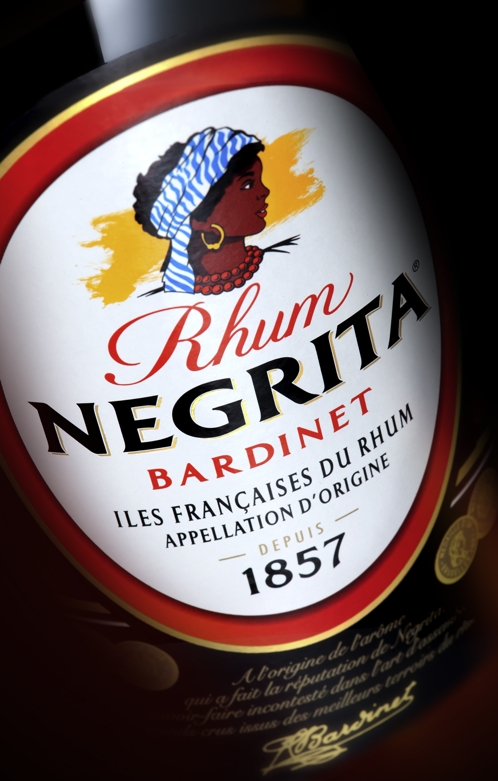
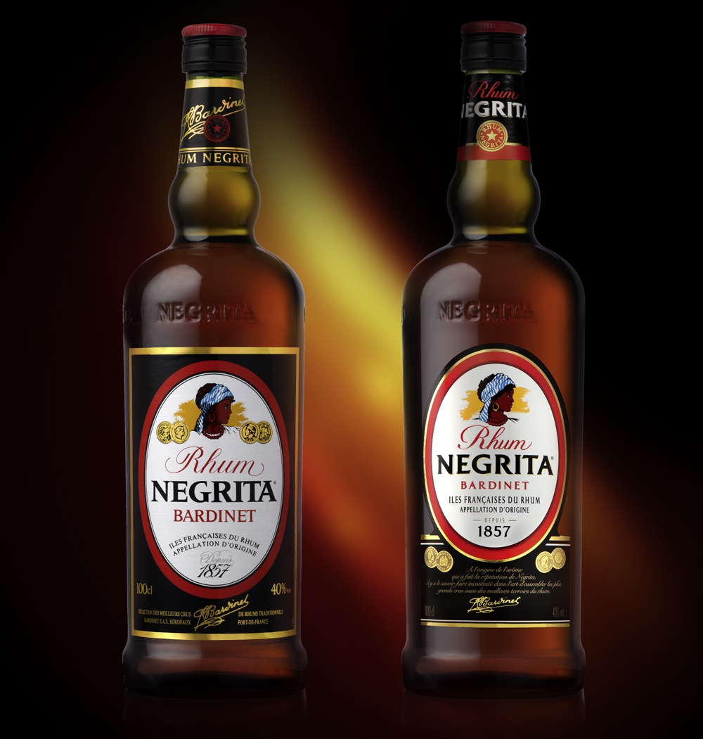
In order to give a new dynamic to the NEGRITA rum brand, BARDINET entrusted LINEA with the modernisation of the packaging. This exceptional Rum with a very pronounced aroma has now achieved international recognition. It was essential that LINEA did not lose sight of the original identity of this Rum that is very specific. As the NEGRITA brand had not changed for over 10 years the lifting was mainly based on the structural elements. The fonts used for the logo have been re-drawn and modernized in order to increase impact and legibility. The reduced size of the label makes it sharper and the iconography of the « Negrita » has been subtly re-worked to give her a more universal appearance without forgetting the creole ancestry of the brand icon. On the whole the new label presentation gives authenticy and credibility to the brand whilst respecting its unique spirit.
NEGRITA – THE ORIGINAL
customer: BARDINET
product: NEGRITA ORIGINAL
market: INTERNATIONAL
linea design manager: CHRISTOPHE
designer: VINCENT
illustrator: PATRICK
- Category: Works