
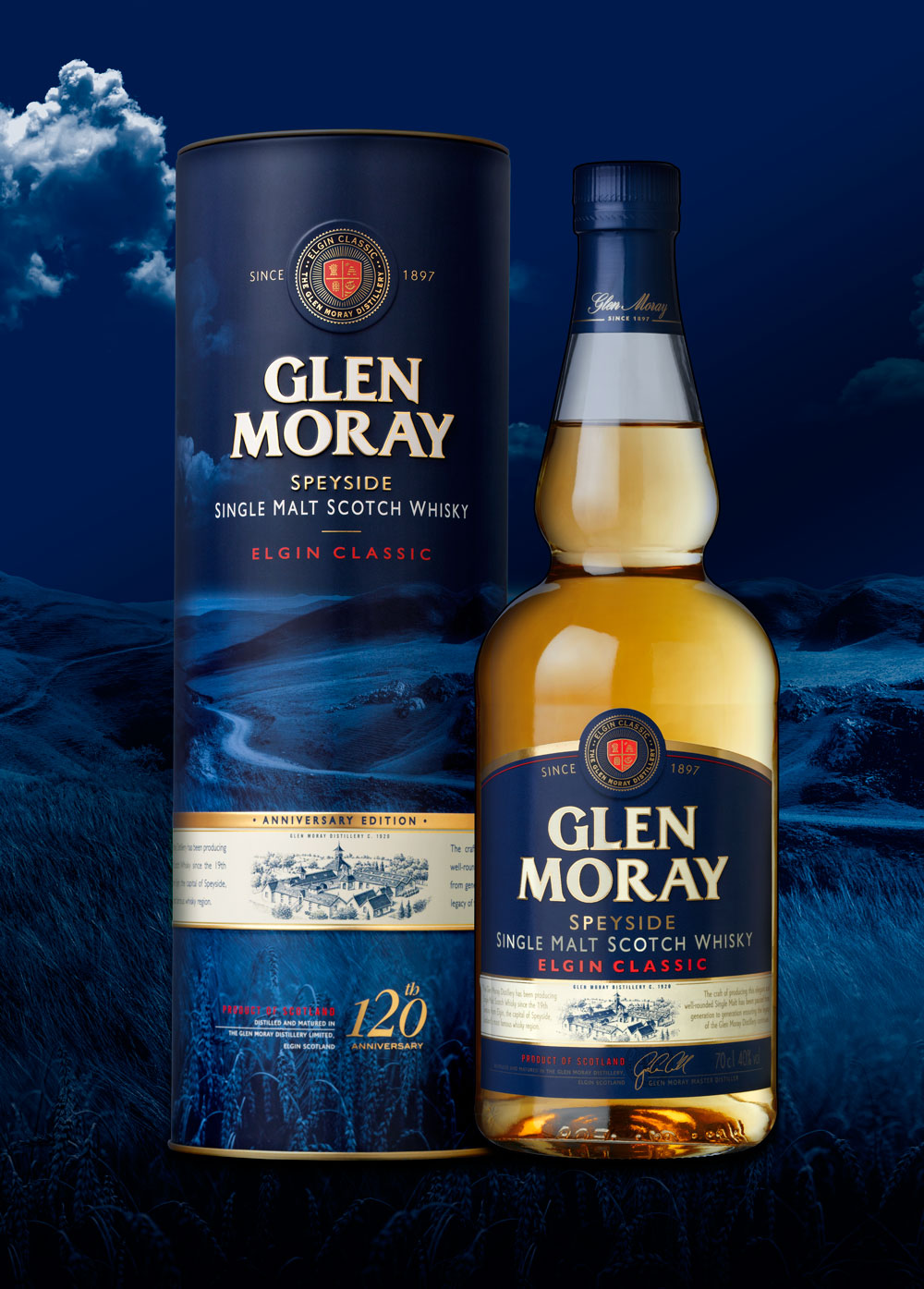
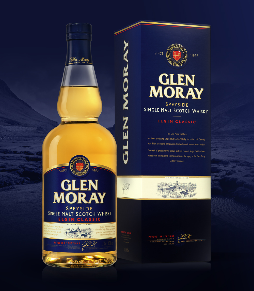
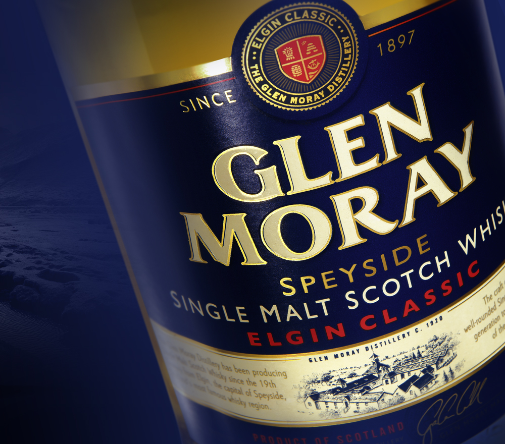
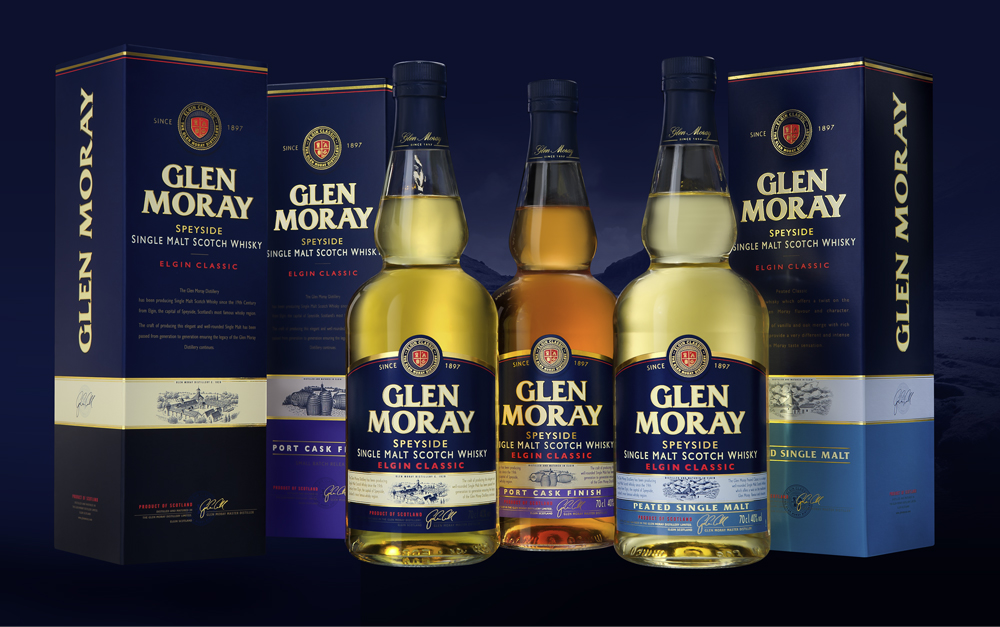
The packaging design agency LINEA was privileged to rework the identity of one of the finest jewels of the «Speyside» region. Located in the heart of the whisky golden triangle, the GLEN MORAY whiskey distillery (owned by the BARDINET French group) wanted to modernize its brand identity as well as the packaging design of its «Finish» Collection. Following a comprehensive approach of « Premiumisation » , the identity of its whiskeys has been subtlety adjusted and simplified in order to gain in elegance and readability. The design architecture stems from a revaluation of the distillery Scottish origins. Its heraldry graphic expression has been redesigned in order to become more relevant and impactful. The illustration of the distillery as well as the « Speyside » origin claim are, in turn, highlighted to strengthen the authenticity and character of the house. Highly recognizable by its deep blue signature, the brand claims again its attachment to this region, which is renowned for providing the most exclusive malts in the world.
GLEN MORAY – GAMME ‘ELGIN CLASSIC’
customer: BARDINET
product: GLEN MORAY – ELGIN CLASSIC
market: INTERNATIONAL
linea design manager: CHRISTOPHE
designer: NATHALIE
illustrator: AMÉLIE
- Category: Works