
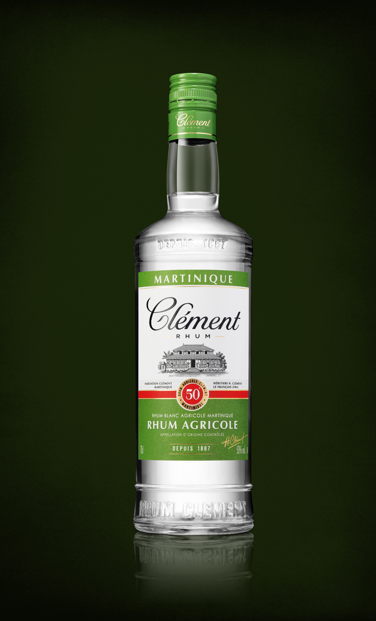
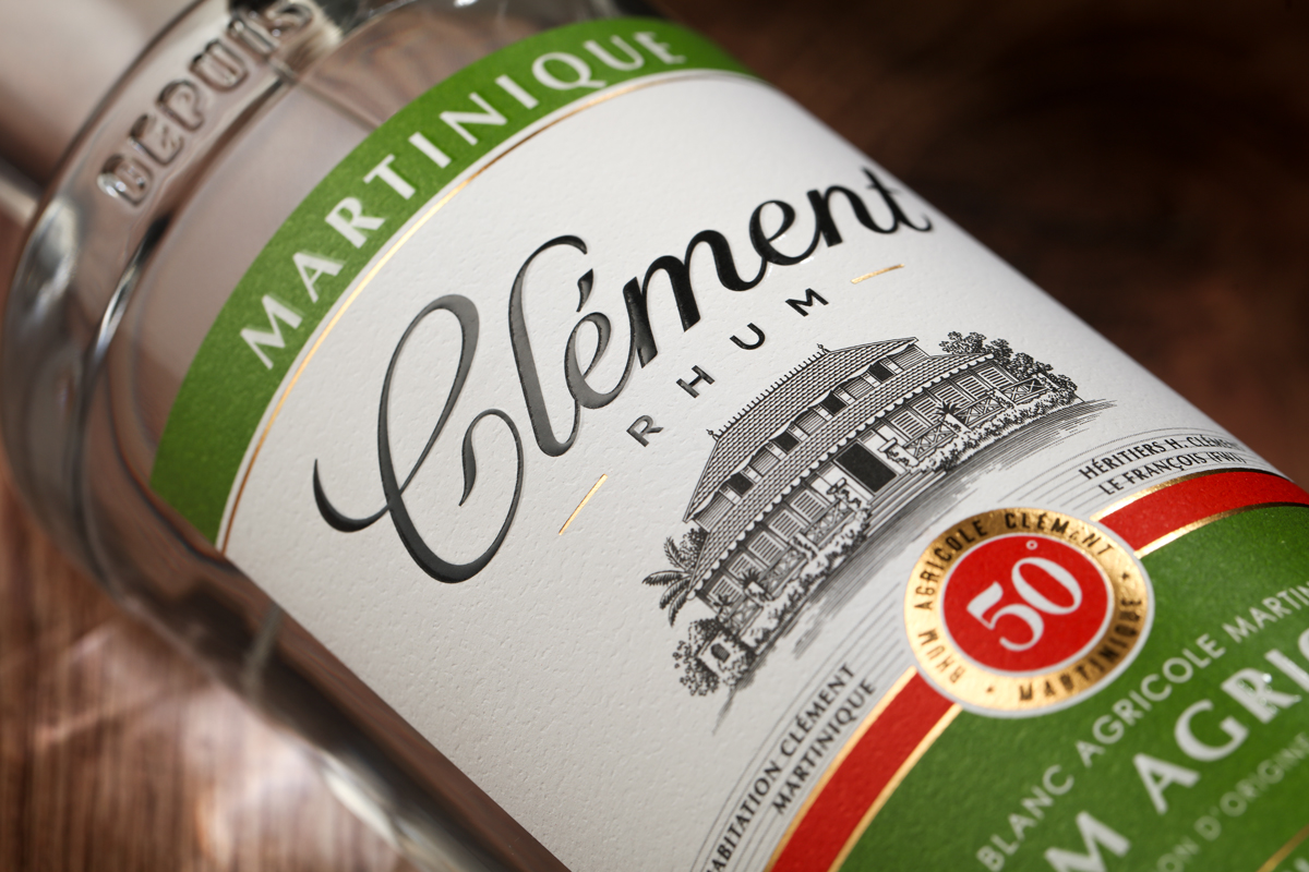
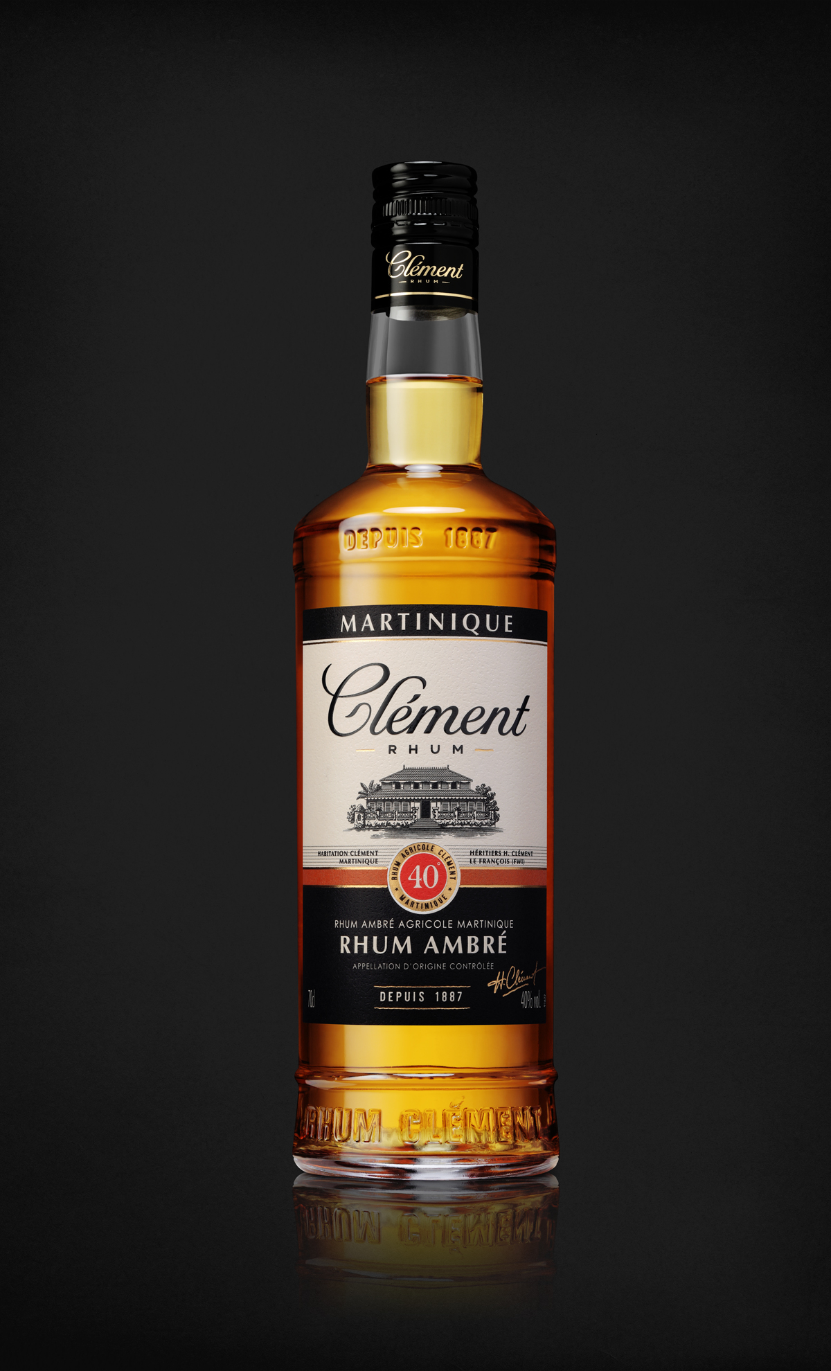
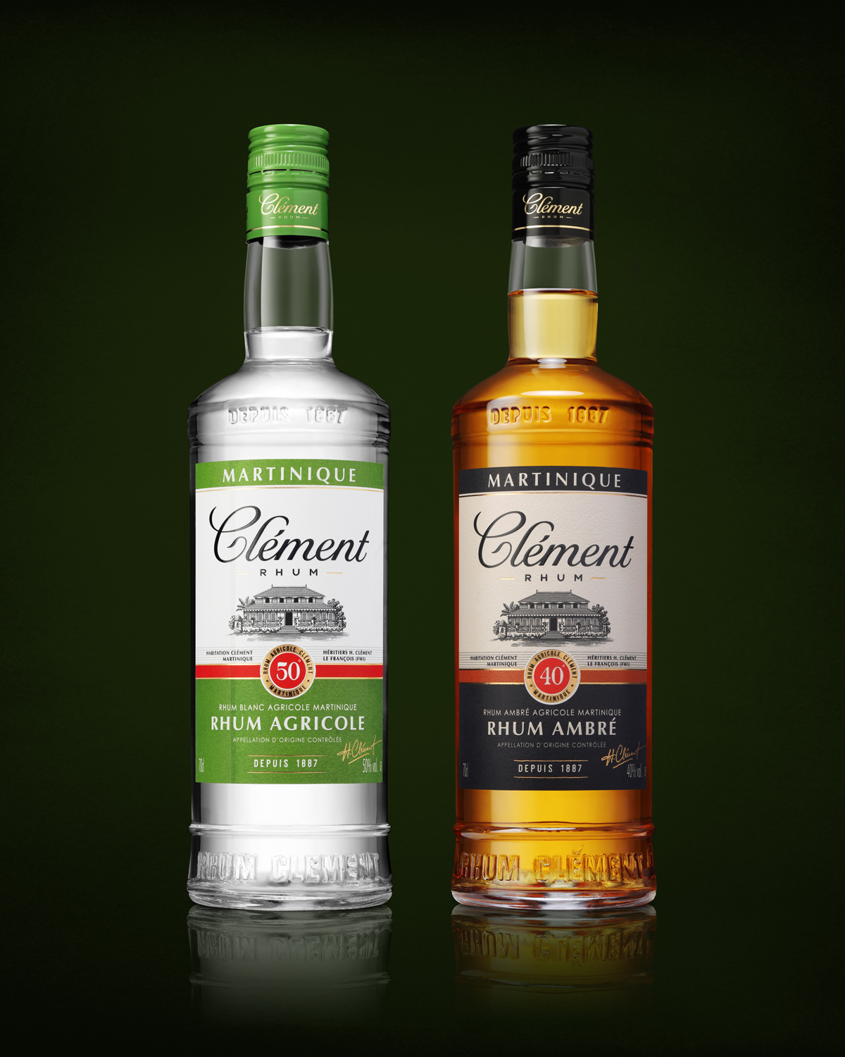
Rhums Clément are passing a gap in their positioning strategy. Emblematic brand of Martinique, it unveils a brand new identity line. We had the pleasure of accompanying the GBH group in this range relifting. The logotype has been reworked to improve its fluidity. The bottle became an original creation. With marked shoulders and a signed bottle, the bottle gains in differentiation and identification within the category. The premiumization of the offer is also seen through the packaging. The color codes and characteristic attributes have been retained. An important work of content hierarchization allows a better visibility of the brand. Particular care has been taken with finishes such as hammered paper or swelling varnish…
CLÉMENT | CORE BRAND
Customer: RHUM CLÉMENT
Product: CORE BRAND (40°, 50°, 55°)
Market: INTERNATIONAL
Designer: CAROLE
- Category: Works